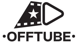
For our company, we have chosen an imagotype as the main image that will visually represent us. 📌✨
The name “Offtube” has been carefully selected to reflect the essence of our platform. Its meaning comes from the combination of two key words:
🔹 “Off” 🚫: Represents being offline, highlighting that our platform works without an internet connection. This reinforces the idea of accessibility anytime, anywhere.
🔹 “Tube” 📺: Refers to the widely used term for audiovisual content, inspired by television (from old cathode ray tubes) and popular video platforms like YouTube.
🔵 Why “Offtube”?
This name clearly conveys our value proposition: a video platform without internet, allowing users to access audiovisual content without relying on an online connection. 🌍📡
With this identity, we aim to differentiate ourselves and offer an innovative solution that responds to the growing need for offline content access. 🚀💡
💡 Conclusion
The colors of the Offtube logo have not been chosen at random; each has a clear purpose: energy and dynamism (coral red), innovation and accessibility (golden yellow), and clarity and simplicity (white). 🎬🚀
This visually appealing combination helps position our brand in a unique and memorable way. Offtube is not just a platform for offline videos—it’s an experience that conveys emotion, innovation, and accessibility! 🎥✨
Let me know if you’d like to create a visual version of the logo based on this concept.